Welcome to my design system: Harpy
In the intricate world of projects immersed in frameworks, I found myself frequently tasked with the challenge of theming these libraries for various teams. However, this endeavor often unfolded into extensive time investments and discussions.
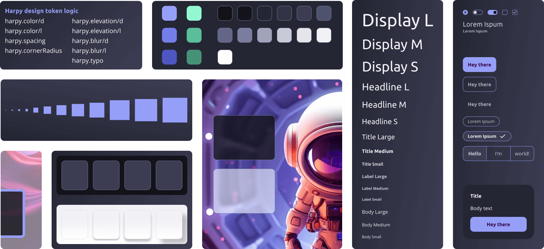
These experiences underscored the vital importance of establishing fundamental rules. Enter Harpy, my design system crafted with a set of simple yet powerful rules to effortlessly achieve a consistent design. This realization solidifies my primary focus on the atom area, as it lays the foundation for a seamless and efficient design process.
Atoms
The Atoms, including colors and fonts, are designed for seamless integration with minimal learning curve. Embracing simplicity, these building blocks ensure a straightforward and efficient design process, allowing you to craft captivating user interfaces effortlessly.
Colors
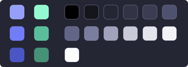
I’ve curated a color set catering to both dark and light themes, adhering to the 70-20-10 rule. This ensures a harmonious balance of primary, secondary, and accent colors for a visually compelling and balanced design experience.
Using the 70-20-10 rule as a guiding concept, I aimed to simplify color handling to prevent potential overwhelm from a myriad of colors and resulting tokens. Designing a system poses the challenge of finding a delicate balance—it shouldn’t be overly complex to ensure execution and scalability, yet not overly simplistic to avoid constraints that lead to frequent rule-breaking.
Hence, I opted for primary and neutral colors, contemplating a secondary color for scenarios where additional depth is required. The system also allows flexibility, permitting alternative color spaces in specific cases, such as infographics. A crucial consideration was ensuring the accent color maintains contrast and readability on both dark and light backgrounds. Subtle variations are therefore permissible.
Typography
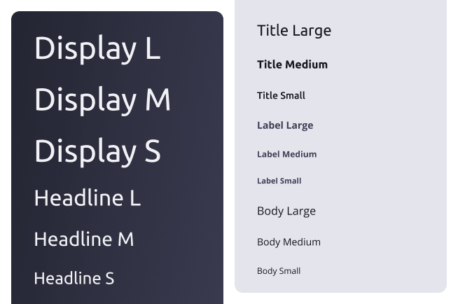
The typography is inspired by the Material 3 logic, incorporating intelligent scaling to adapt seamlessly across various screen sizes.
Molecules
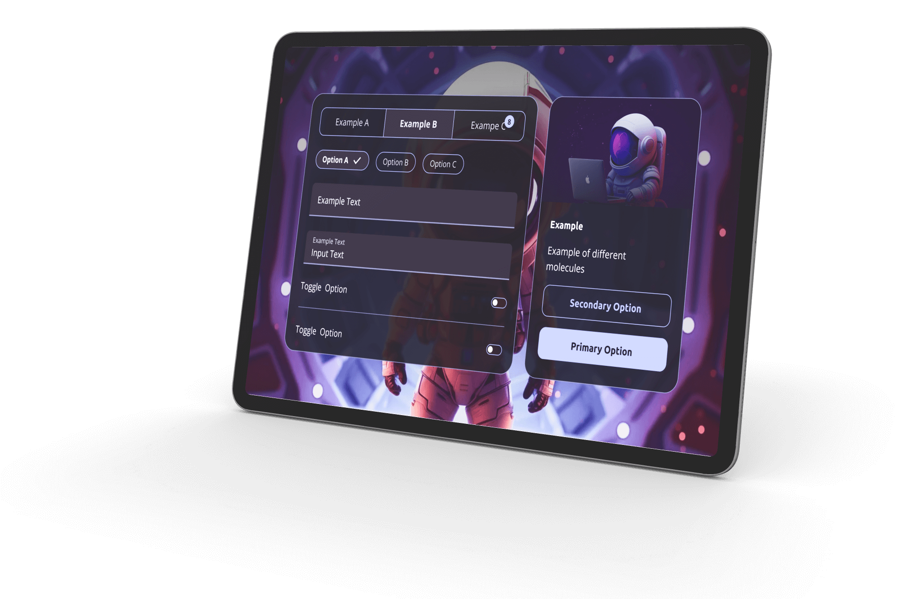
Harpy places its main focus on defining a clear set of rules for the atoms, ensuring their smooth integration into different libraries such as iOS and Material. However, particularly with Angular Material or web projects, I find myself enjoying the freedom to craft my own unique component set. Harnessing the speed and flexibility of Figma, I’m currently in the process of building this bespoke component library. Although it’s a work in progress, the following offers a glimpse into how these components harmoniously come together for enhanced functionality and design coherence.


