

Greetings fellow design enthusiasts! Today, I’m thrilled to share a game-changing discovery that transformed my design journey and promises to revolutionize yours. Enter the 70-20-10 color rule – a design alchemist that turned my color decisions into a harmonious symphony.
A Serendipitous Discovery
As I navigated the intricate world of design, I stumbled upon the transformative magic of the 70-20-10 color rule. This revelation became a guiding light, simplifying my color decisions and infusing a newfound ease into my creative process. Now, join me in unraveling the secrets of this rule – a discovery that not only simplified my decision-making but added a layer of consistency that enhanced the overall user experience.
The 70-20-10 Rule Demystified
At its core, the 70-20-10 rule became my trusted companion, easing the decision-making burden when choosing colors for my designs. Let’s break it down and explore how it can make your design experience as enjoyable and streamlined as it has for me.
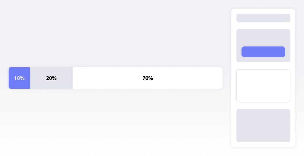
At its core, the 70-20-10 rule is a guiding philosophy that eases the decision-making burden when choosing colors for your designs. Let’s break it down:
- 70% Dominant Color: This is the main player, setting the tone for your design. It’s the color that defines your brand identity, creating a strong and memorable impression.
- 20% Secondary Color: Playing a supporting role, the secondary color complements the dominant color, adding depth and nuance to your design. Think of it as the harmony in a musical composition.
- 10% Accent Color: The show-stealer, the accent color injects vibrancy and surprise into your design. It demands attention and highlights key elements, guiding the user’s gaze.
Colors communicate a language of their own, influencing emotions and user experiences. The dominant color shapes your brand, the secondary color guides users seamlessly, and the accent color sparks engagement.
The Pareto Principle in Color Management
Just as the Pareto Principle streamlines decision-making in other realms, the 70-20-10 rule simplifies color choices, making it easier for users to navigate and comprehend your content. It’s an effective tool for maintaining consistency. While rules are essential, creativity often thrives in breaking them. Please remember that you can break the 70-20-10 rule but with finesse to make your most important message clear.
Conclusion: Painting a Future of Vibrant Designs
As you incorporate the 70-20-10 rule into your design toolkit, remember that colors are not just visuals—they’re an integral part of the user experience narrative. Let this rule be your guide, transforming your design process into a symphony of vibrant and consistent hues.
In the world of UX and UI design, the 70-20-10 rule emerges as your trusted ally, simplifying decisions, fostering consistency, and elevating your creative journey. Cheers to a future filled with brilliantly orchestrated designs that leave a lasting impression!